Travella Mobile App
Travella Mobile App

Travella
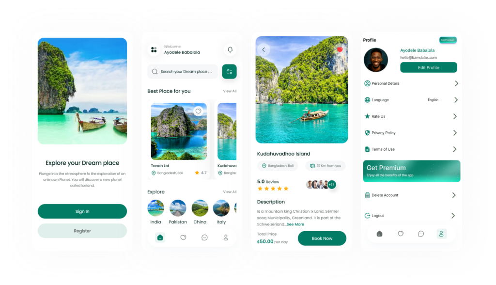
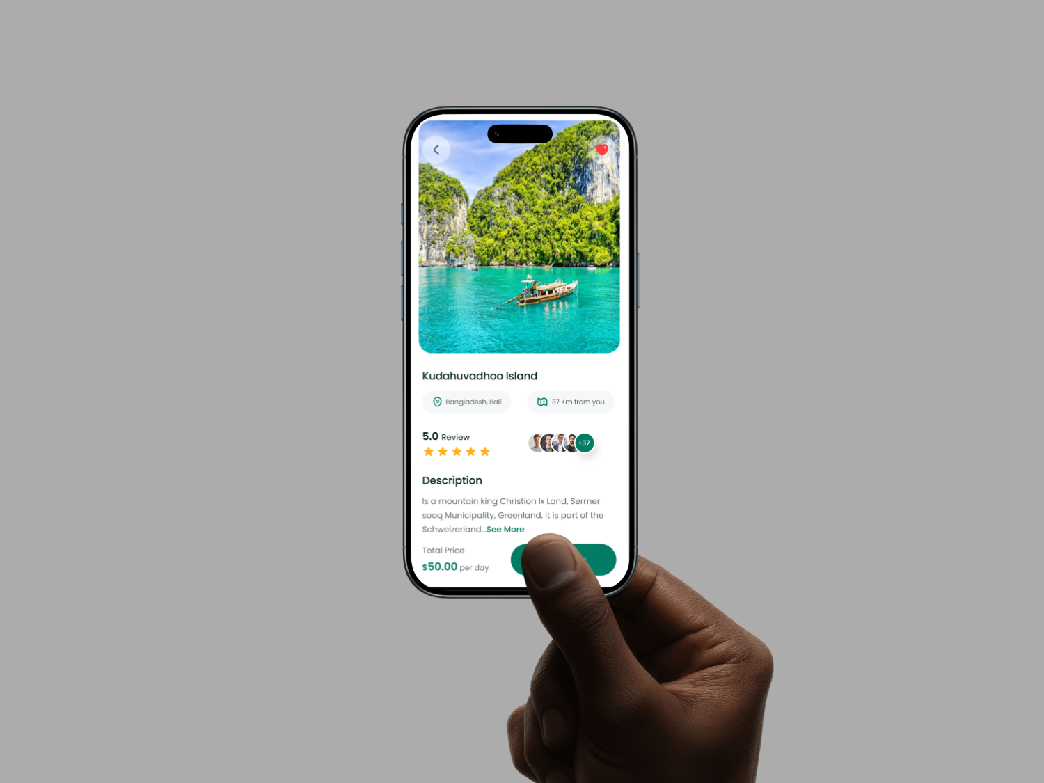
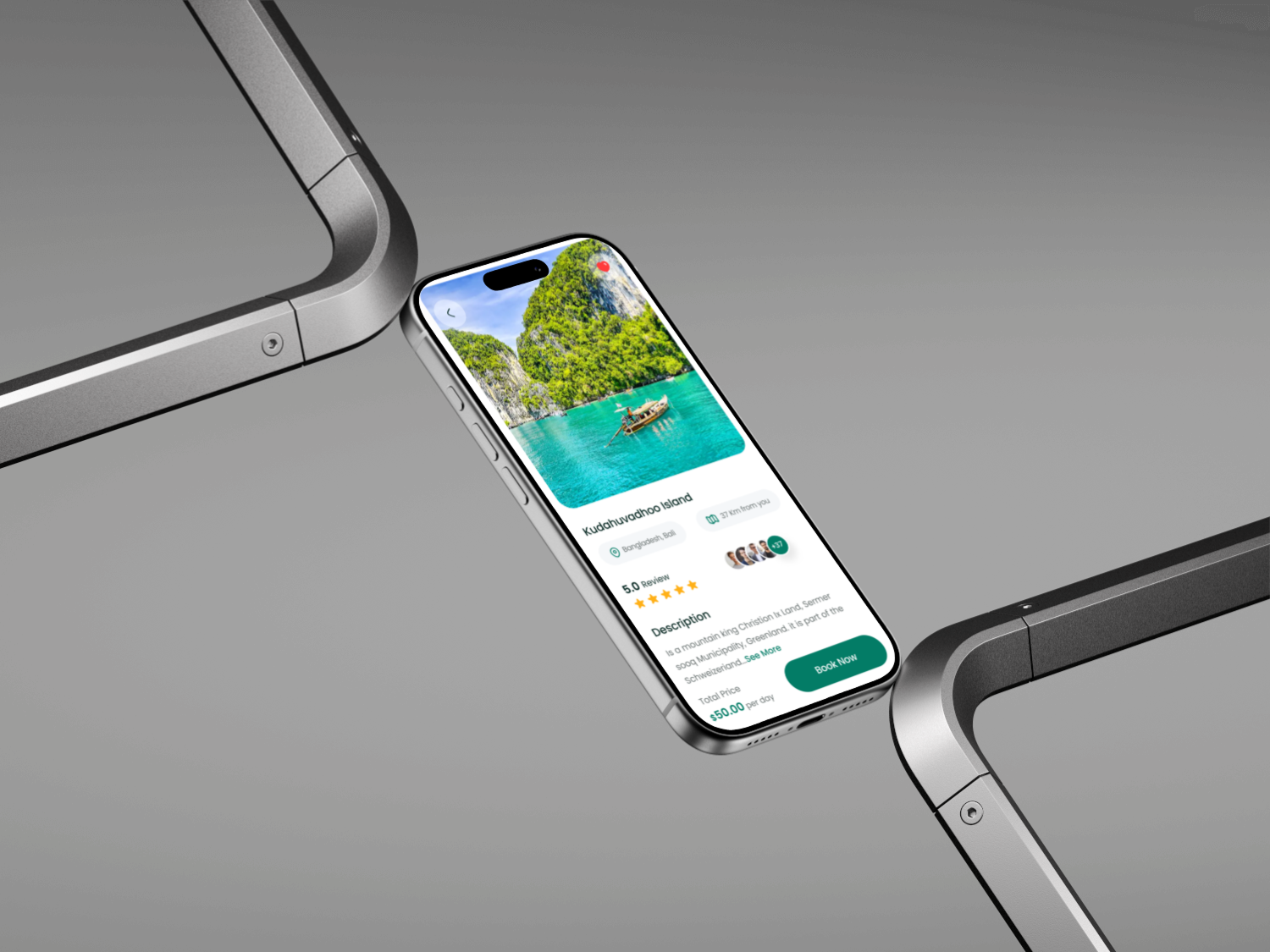
It's an app that solves all your vacation needs, from booking a cheap flight, checking interesting places to visit in a country, saving your memories and scheduling your future travel plans
Category
Ui/Ux Design
Project
Travella
Start Date
January 17, 2025
Designer
Ayodele Babalola
Location
U.S.A
Industry
Hospitality


What is Travella?
Travella is a cutting edge mobile app that allows users to save memories for future purposes. You can easily store, explore and plans for your future travells
Design Process
The Ui/Ux for Travella is carefully crafted to meet user's needs.
The following processes was carefully taken into consideration before developement
1. Research & Discovery
2. Information Architecutre
3. Wireframing
4. Visual Design
5. Prototyping
6. Usability Testing
Problem & Solution
Problem Statement: How can people save their personal memories, access thier past vacations, present ones and also help them to plan for the future ones?
Soutions: I need to make the Ui of the app user friendly with a clean layout, consistent icons and making the navigations easy.
My Approach
As a UI/UX designer passionate about seamless travel experiences and turning wanderlust into effortless adventures, I am excited to dive into the Travella app. The core vision, solving all vacation needs from booking affordable flights to discovering hidden gems, capturing cherished memories, and planning future trips, inspires a platform that feels like a personal travel companion. My goal is to design an intuitive, joyful interface that caters to spontaneous explorers and meticulous planners alike, blending functionality with aspirational visuals to spark excitement for every journey.
1. Discovery and Research (Weeks 1 to 2). User Interviews and Surveys: Start with 10 to 15 semi structured interviews: 5 to 7 travelers (diverse in profiles, from solo backpackers to family vacationers) and 5 to 7 aspiring planners (mix of budget conscious millennials, retirees, and adventure seekers). Questions focus on pain points, like frustration with fragmented booking sites or forgetting trip highlights, and behaviors, e.g., "How do you currently plan and remember vacations?" Competitive Analysis: Review apps like TripIt or Google Trips to identify gaps (e.g., their disjointed memory features) and strengths (e.g., integrated maps for discoveries). Key Insights: Users need one tap flight deals with real time alerts; explorers crave interactive country guides with AR previews; memory savers want auto tagged photo journals; planners seek calendar syncs with customizable itineraries.
Deliverables: Empathy maps and initial user personas.
2. Define Personas and User Journeys (Weeks 3 to 4). Personas: Traveler Persona: Alex, 28, Freelance Digital Nomad: Loves spontaneous deals but juggles multiple apps. Goals: Quick flight bookings, on the go place recommendations, effortless memory uploads via camera integration. Planner Persona: Maria, 42, Working Mom in a City: Balances family budgets and schedules tightly. Goals: Curated country itineraries, shared family memory albums, seamless future trip calendars with reminders. User Journeys: Traveler Journey: Onboarding → Flight Search (deal scanner) → Destination Discovery (interactive maps) → Memory Capture (in app journal) → Trip Wrap Up. Planner Journey: Signup → Itinerary Builder (drag and drop schedules) → Place Exploration (filtered guides) → Memory Archive → Future Planning (recurring trip templates). Pain Points Mapped: Use journey maps to highlight friction, like overwhelming search results or manual photo sorting, and opportunities like voice activated bookings. Deliverables: Detailed personas (with photos, quotes) and journey maps visualized in figma
3. Information Architecture and Wireframing (Weeks 5 to 6). Core Structure: A tab based bottom navigation for ease, Home (personalized dashboard with deals and memories), Explore (country guides and places), Book (flights and itineraries), Memories (saved stories), Plans (future scheduler). Dual modes: Switch between "Now" for active trips and "Later" for planning. Key Screens: Onboarding: 4 step carousel: "Unlock Your Dream Vacations," user type selector (explorer or planner), quick email or social login. Explore Screen: Geo aware map with pins for attractions, filters (budget, family friendly, hidden spots), and swipe cards with 360 previews. Booking Flow: AI driven flight comparator with price calendars, bundled with place suggestions. Memory Journal: Timeline view for uploads (photos, notes, voice clips) auto linked to locations. Scheduler: Calendar integration with drag to reschedule, shareable links for group plans. Accessibility Focus: Gesture based navigation, alt text for images, multilingual support for global users.
Deliverables: Low fidelity wireframes in Figma, tested via quick usability sessions with 5 stakeholders.
4. Prototyping and Visual Design (Weeks 7 to 9). Interactive Prototypes: High fidelity prototypes in Figma with micro interactions, like a "deal unlocked" confetti burst for bookings or smooth fades in memory timelines, to evoke wanderlust. Design System: Colors: Vibrant blues (#2196F3) for skies and seas, sunset oranges (#FF5722) for energy, soft neutrals for calm planning. Typography: Sans serif (e.g., Open Sans) for airy readability; italic accents for inspirational quotes. Icons and Imagery: Custom travel icons (e.g., plane for bookings, pin for places), high resolution user generated photos with subtle filters for a postcard feel. Theming: Day/night modes tied to user location; offline caching for remote discoveries. Responsive Design: Mobile first (95% of users on phones), with landscape optimizations for itinerary reviews.
Deliverables: Clickable prototype and style guide (colors, components library).
5. Usability Testing and Iteration (Weeks 10 to 12). Testing Rounds: Two cycles, first with 8 users (4 explorers, 4 planners) via remote tools like UserTesting. Tasks: "Book a budget flight to Italy" or "Save a Paris memory and schedule a follow up trip." Metrics: Task success rate (>90% goal), time on task, CSAT for delight. Feedback Loops: Heatmaps to spot drop offs (e.g., if place filters overwhelm, simplify to voice search). A/B test variants, like grid vs. list for country guides. Inclusivity Check: Ensure accessibility (e.g., screen reader for maps) and global relevance (currency toggles, cultural event highlights). Iterations: Refine based on data, e.g., add collaborative editing for shared plans if group travel emerges.
Deliverables: Test reports with video clips, revised prototypes, and handover specs for developers.
6. Launch Prep and Handoff (Week 13+). Collaboration: Weekly syncs with PMs and developers using Zeplin for assets. Define metrics like conversion (bookings per session) and retention (repeat planning). Post Launch: Plan for ongoing UX audits, feature roadmaps (e.g., VR place tours), and user feedback loops via in app prompts. Success Measure: An app where users say, "Travella made my trip magical from dream to memory," feeling every vacation need met in one tap.
This approach keeps the design agile, user driven, and aligned with Travella's mission of holistic travel empowerment. By prioritizing empathy and iteration, i created not just an app, but a passport to unforgettable journeys.

