Farmas Mobile App
Farmas Mobile App
Farmas App
It's an app that solves consumers need, they can easily order farm produce directly from the mobile app, thereby removing the stress of going to the market.
Category
Ui/Ux Design
Project
Farmas
Start Date
September 17, 2024
Designer
Ayodele Babalola
Location
Nigeria
Industry
Food
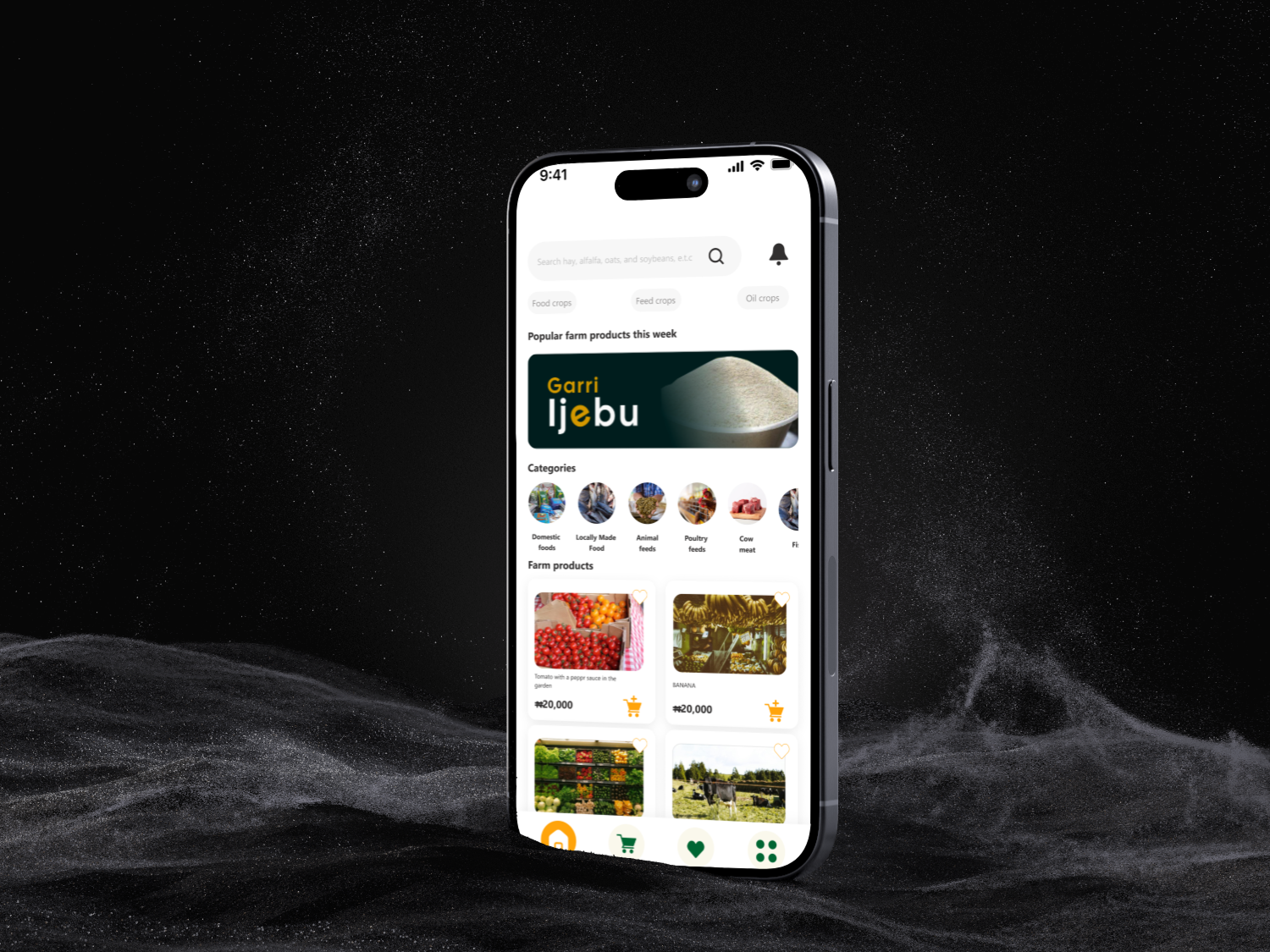
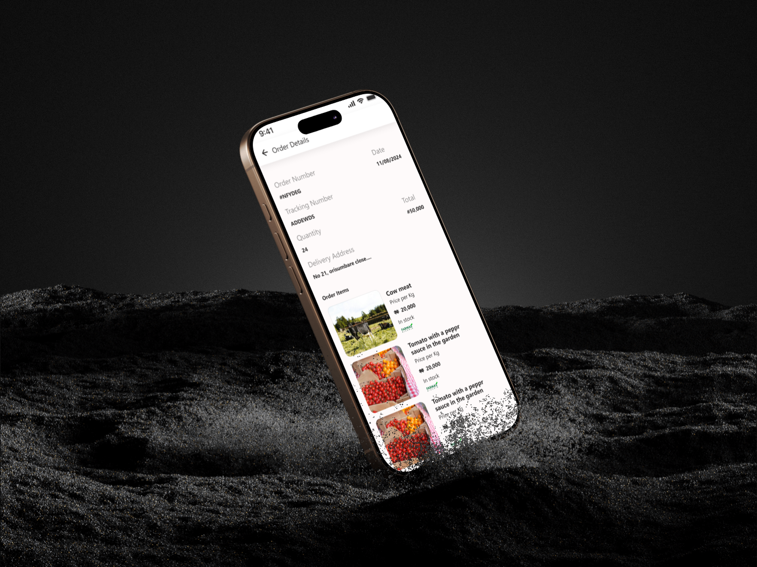
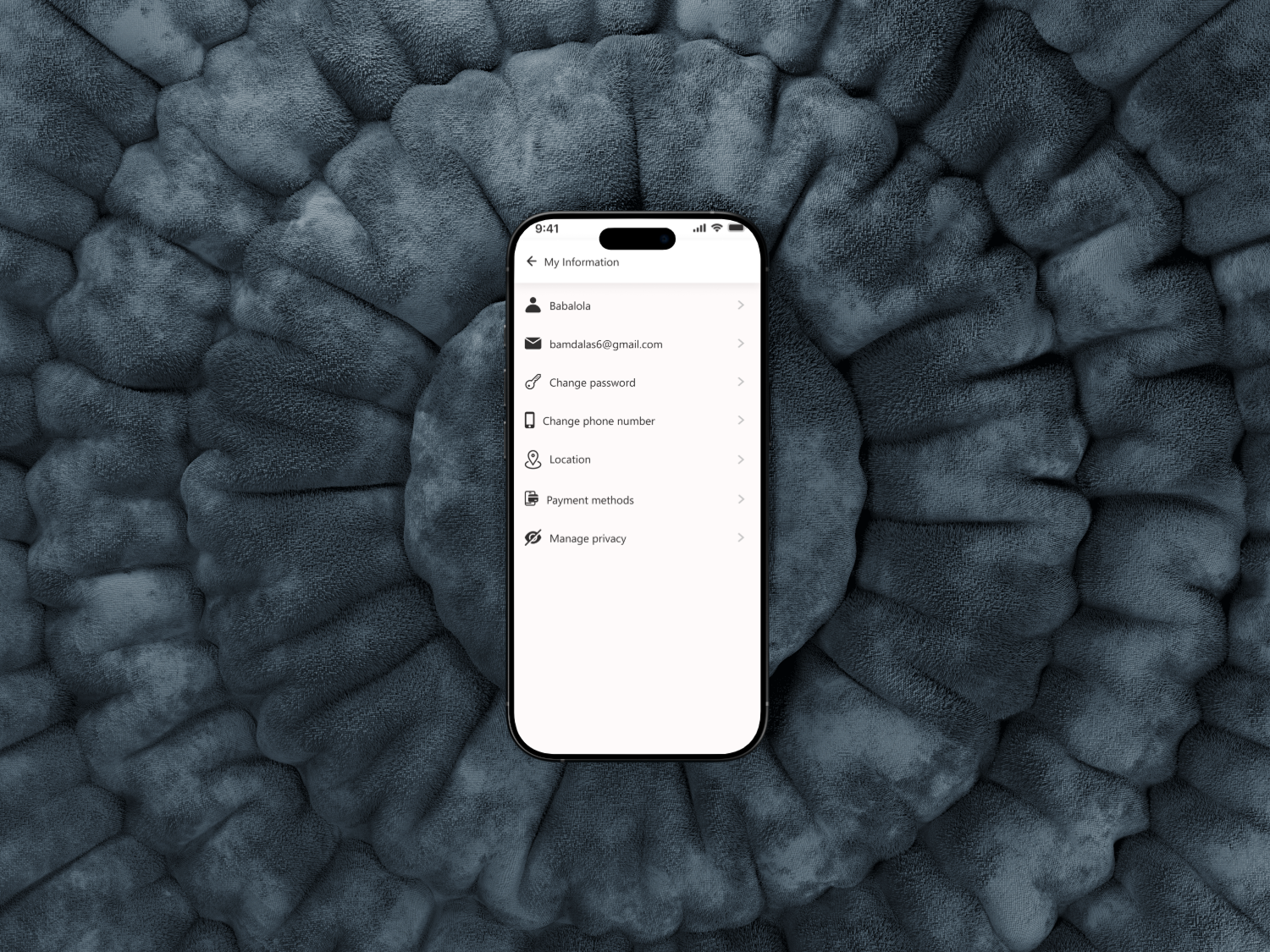

What is Farmas?
Farmas app focus on solving how farm produce reach the consumer, total boycotting the market, the farmers will register and also the consumers and giving the consumers the power to order directly from the farm.
Design Process
The Ui/Ux for Farmas App is carefully crafted to meet user's needs.
The following processes was carefully taken into consideration before developement
1. Research & Discovery
2. Information Architecutre
3. Wireframing
4. Visual Design
5. Prototyping
6. Usability Testing
Problem & Solution
Problem Statement: How can people get fresh farm produce directly from the farm and at a cost effective prices?
Soutions: I need to make the Ui of the app user friendly with a clean layout, consistent icons and making the navigations easy.
My Approach
As a UI/UX designer passionate about sustainable tech and empowering local economies, I am thrilled to tackle the Farmas app. The core vision, cutting out middlemen by enabling direct farm to consumer ordering, aligns perfectly with creating an intuitive, trustworthy platform that democratizes access to fresh produce. My goal is to craft an experience that is seamless for both farmers (who might be tech novices in rural areas) and consumers (urban dwellers craving transparency and convenience). I will emphasize simplicity, accessibility, and a warm, earthy aesthetic to evoke the farm fresh vibe.
1. Discovery and Research (Weeks 1 to 2). User Interviews and Surveys: Start with 10 to 15 semi structured interviews: 5 to 7 farmers (diverse in scale, from small organic growers to mid sized operations) and 5 to 7 consumers (mix of busy professionals, families, and eco conscious shoppers). Questions focus on pain points, like farmers frustration with market delays or consumers distrust in supply chains, and behaviors, e.g., "How do you currently source produce?"
Competitive Analysis: Review apps like Farmdrop or LocalHarvest to identify gaps (e.g., their clunky registration flows) and strengths (e.g., visual product galleries). Key Insights: Farmers need quick photo uploads for listings; consumers want real time farm updates and traceability (e.g., "This tomato was picked 2 days ago").
Deliverables: Empathy maps and initial user personas.
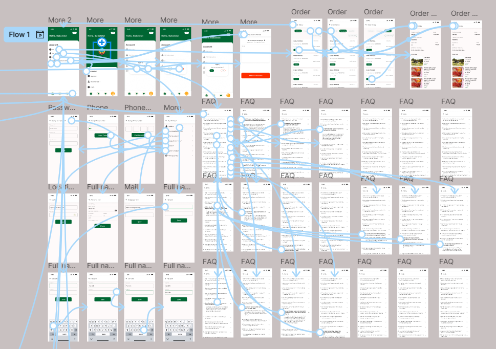
2. Define Personas and User Journeys (Weeks 3 to 4). Personas: Farmer Persona: Raj, 45, Smallholder in Rural India: Tech savvy enough for WhatsApp but overwhelmed by complex apps. Goals: Easy registration, simple inventory management, and payout tracking. Consumer Persona: Priya, 32, Urban Millennial in Mumbai: Values sustainability but hates scrolling endless catalogs. Goals: Personalized recommendations, one tap ordering, and farm stories for that "direct from source" feel. User Journeys: Farmer Journey: Onboarding → Product Listing (upload photos, set prices/availability) → Order Management (notifications, fulfillment) → Payouts. Consumer Journey: Signup → Browse Farms (map based discovery) → Order (custom bundles, subscriptions) → Tracking and Delivery. Pain Points Mapped: Use journey maps to highlight friction, like farmers struggling with geo tagging or consumers needing allergy filters.
Deliverables: Detailed personas (with photos, quotes) and journey maps visualized in tools like Figma.
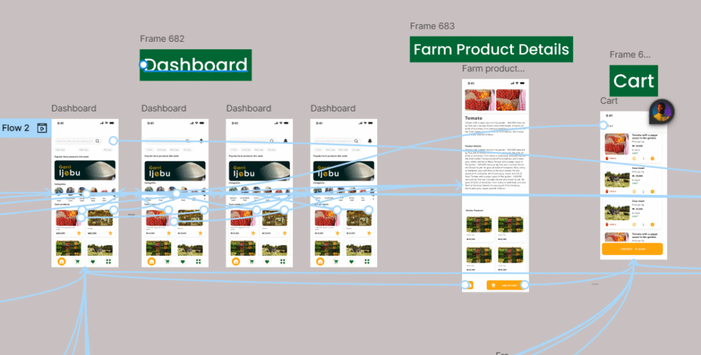
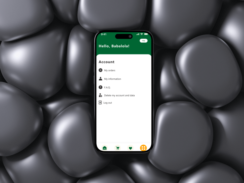
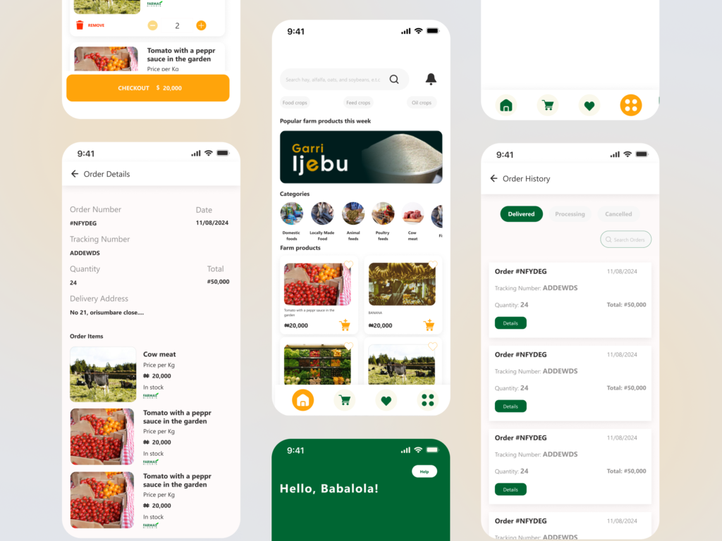
3. Information Architecture and Wireframing (Weeks 5 to 6). Core Structure: A tab based bottom navigation for simplicity, Home (personalized feed), Farms (search/browse), Orders (active/past), Profile (settings/payouts). Dual flows: Farmer mode toggles to a dashboard with analytics (e.g., "Your carrots sold out, restock?"). Key Screens: Onboarding: 3 step carousel: "Welcome to Farmas, Connect Directly," farmer/consumer selector, quick social login or phone OTP. Farmer Dashboard: Drag and drop for adding produce (e.g., snap photo → auto categorize via simple AI tags like "organic apples"). Consumer Browse: Interactive map with pins for nearby farms, filters (price, freshness, certifications), and swipeable cards showing farm bios ("Meet Raj's 5 acre paradise"). Ordering Flow: Cart with dynamic pricing (e.g., "Fresh harvest discount: 10% off"), chat integration for custom requests. Accessibility Focus: Large tappable areas, high contrast text, voice over support for rural users with varying literacy levels.
Deliverables: Low fidelity wireframes in Figma, tested via quick usability hovers with 5 stakeholders.
4. Prototyping and Visual Design (Weeks 7 to 9). Interactive Prototypes: High fid prototypes in Figma with micro interactions, like a "harvested" animation when orders are confirmed, to build delight. Design System: Colors: Earthy palette, vibrant greens for growth, warm oranges for freshness, neutrals for readability. Typography: Sans serif (e.g., Roboto) for clean readability; bold for farm names to add personality. Icons and Imagery: Custom line icons (e.g., leaf for organic), high res user uploaded farm photos with subtle overlays for metadata (e.g., "Harvested: Today"). Theming: Light/dark modes; offline support indicators for spotty rural internet. Responsive Design: Mobile first (90% of users on phones), with tablet optimizations for farmers inventory views.
Deliverables: Clickable prototype and style guide (colors, components library).
5. Usability Testing and Iteration (Weeks 10 to 12). Testing Rounds: Two cycles, first with 8 users (4 farmers, 4 consumers) via remote tools like UserTesting. Tasks: "List a new crop" or "Order a veggie box under ₹500." Metrics: Task success rate (>85% goal), time on task, NPS. Feedback Loops: Heatmaps to spot drop offs (e.g., if photo uploads confuse farmers, simplify to "Tap to Snap"). A/B test variants, like card vs. list views for browsing. Inclusivity Check: Ensure cultural relevance (e.g., Hindi/regional language toggles) and equity (low data mode for images). Iterations: Refine based on data, e.g., add a "Farm Story" video upload if users crave more connection.
Deliverables: Test reports with video clips, revised prototypes, and handover specs for devs.
6. Launch Prep and Handoff (Week 13+). Collaboration: Weekly syncs with PMs/devs using Zeplin for assets. Define metrics like retention (e.g., repeat orders) and engagement (farm registrations). Post Launch: Plan for ongoing UX audits, feature roadmaps (e.g., AR previews of produce), and user feedback loops via in app surveys. Success Measure: An app where farmers say, "This feels like chatting at the market," and consumers think, "Finally, produce as fresh as the farm."
