Crexito HR Mobile App
Crexito HR Mobile app

Crextio
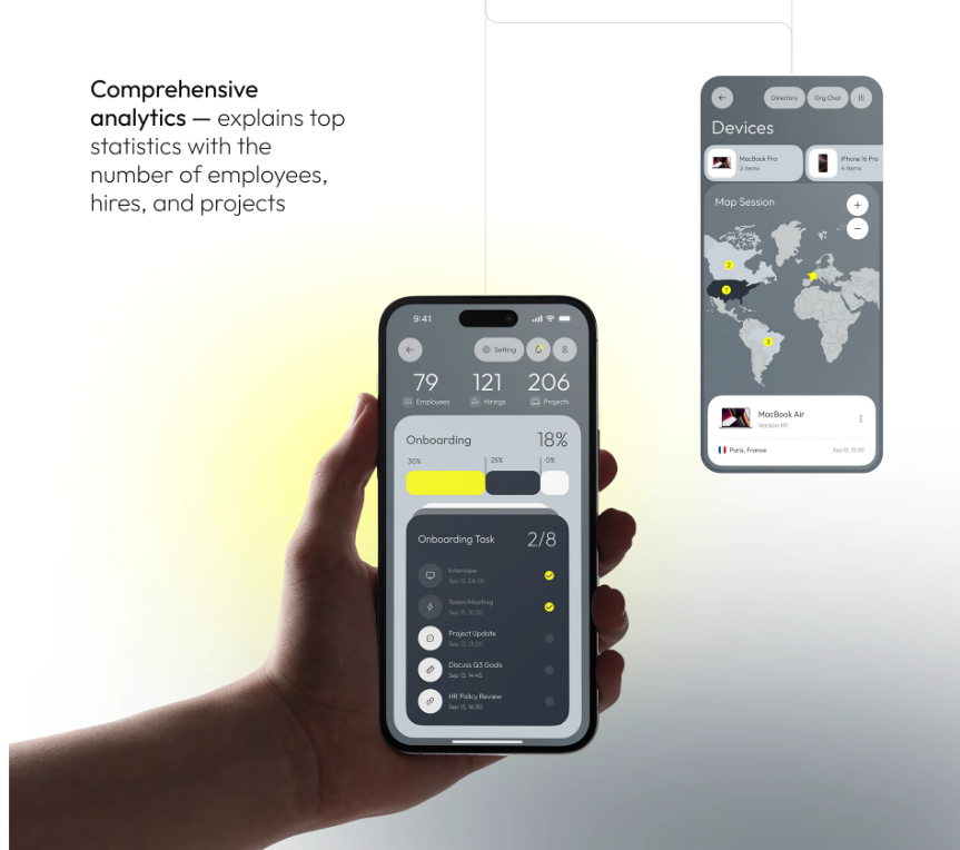
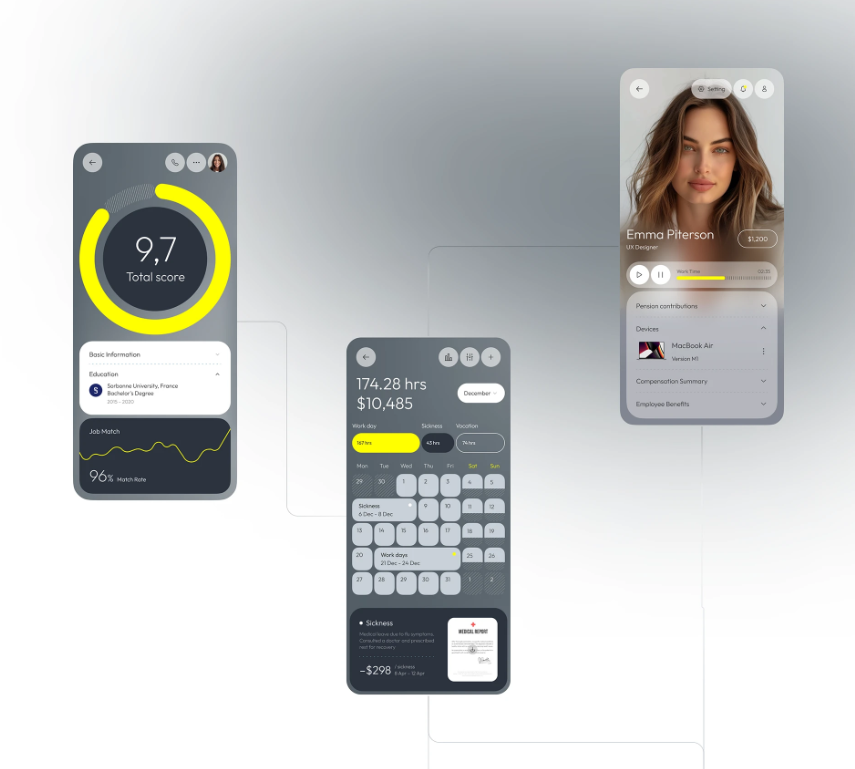
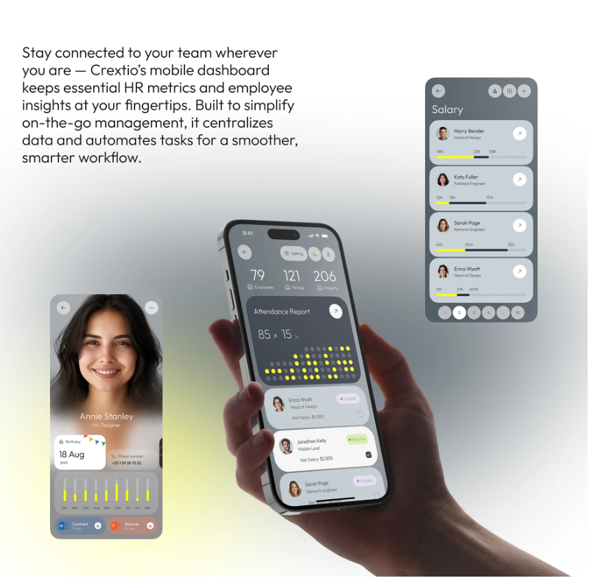
It's an app that has all-in-one HR utilities, user friendly and clean navigations.
Category
Ui/Ux Design
Project
Crextio
Start Date
March 30, 2024
Designer
Ayodele Babalola
Location
United Kingdom
Industry
Hospitality
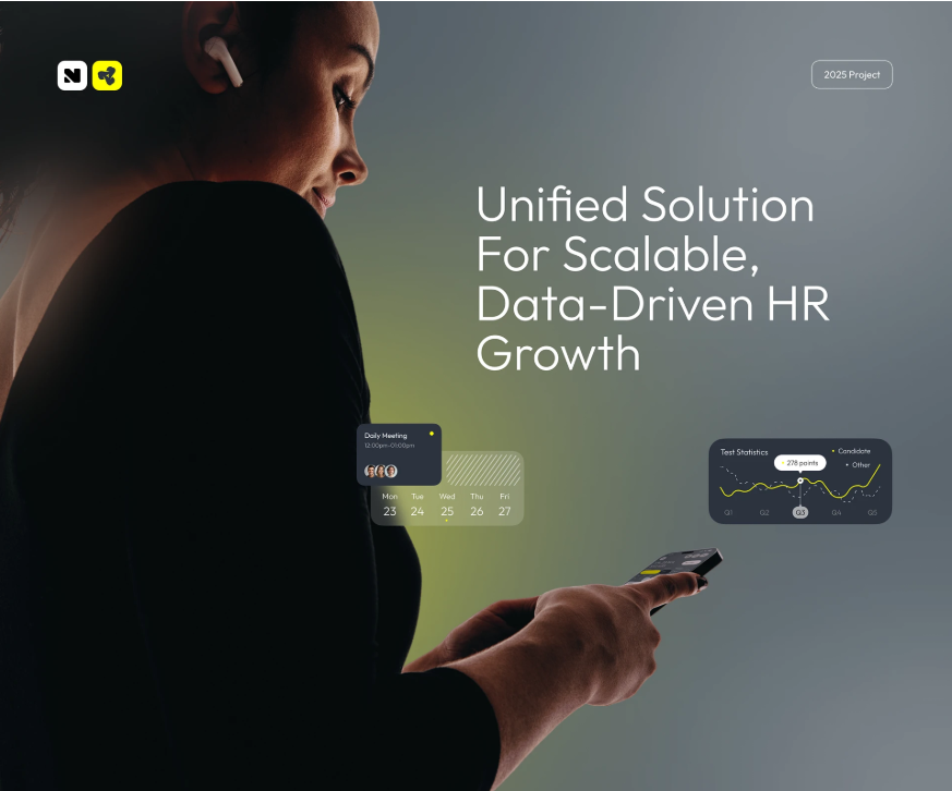



What is Crextio?
It’s an app that has all-in-one HR utilities, user friendly and clean navigations.
Design Process
The Ui/Ux for Crextio is carefully crafted to meet user's needs.
The following processes was carefully taken into consideration before developement
1. Research & Discovery
2. Information Architecutre
3. Wireframing
4. Visual Design
5. Prototyping
6. Usability Testing
Problem & Solution
Problem Statement: I need a dashboard that organizes everything in one place, tracks key HR metrics in real time, and helps me makes smarter decisions - Fast.
Soutions: I need to make the Ui of the app user friendly with a clean layout, consistent icons and making the navigations easy.
My Approach
As a UI/UX designer passionate about data driven insights and streamlining business operations, I am excited to shape the Crexito dashboard. The core vision, centralizing all HR elements into one cohesive view while delivering real time metrics for rapid, informed decisions, calls for a platform that transforms complex data into actionable clarity. My goal is to create an interface that is efficient for busy HR leaders, visually intuitive, and empowering, reducing decision time from hours to minutes through smart visualizations and alerts.
I will break down my approach into phased steps, drawing from human centered design principles. This ensures the dashboard not only aggregates HR data but also anticipates user needs: HR pros feel in control, executives gain quick overviews, and the system drives proactive strategies.
1. Discovery and Research (Weeks 1 to 2). User Interviews and Surveys: Start with 10 to 15 semi structured interviews: 5 to 7 HR managers (from small startups to large enterprises) and 5 to 7 executives (C suite with HR oversight). Questions focus on pain points, like siloed tools causing delays or outdated reports hindering hires, and behaviors, e.g., "How do you currently monitor turnover or recruitment funnels?"
Competitive Analysis: Review tools like BambooHR or Workday to identify gaps (e.g., their slow refresh rates) and strengths (e.g., customizable widgets).
Key Insights: Users need live dashboards with drill down metrics (e.g., employee engagement scores updating instantly); decision makers want AI flagged anomalies like "Rising absenteeism alert: Review Q4 hires."
Deliverables: Empathy maps and initial user personas.
2. Define Personas and User Journeys (Weeks 3 to 4).
Personas: HR Manager Persona: Jordan, 35, Mid Level HR Lead at a Tech Firm: Juggles daily ops but drowns in spreadsheets. Goals: Real time tracking of metrics like headcount and diversity stats, one click exports for reports. Executive Persona: Taylor, 48, CHRO at a Corporation: Needs high level snapshots for board meetings. Goals: Customizable views of KPIs like cost per hire, predictive trends for retention risks. User Journeys: HR Manager Journey: Login → Dashboard Overview (key metrics grid) → Deep Dive (filter by department) → Alert Response (auto suggested actions) → Export Insights.
Executive Journey: Access → Executive Summary (trend charts) → Metric Alerts (push notifications) → Decision Simulator (what if scenarios). Pain Points Mapped: Use journey maps to highlight friction, like cluttered screens overwhelming users or lag in mobile views, and opportunities like voice query for metrics.
Deliverables: Detailed personas (with photos, quotes) and journey maps visualized in Figma.
3. Information Architecture and Wireframing (Weeks 5 to 6).
Core Structure: Modular dashboard with drag and drop widgets, sidebar navigation for sections like Overview, Metrics, Alerts, Reports. Role based views: HR gets granular controls, execs see aggregated tiles. Key Screens: Onboarding: Quick setup wizard: "Connect your HR tools," select key metrics, personalize layout. Metrics Dashboard: Real time cards for turnover rate, time to fill, eNPS with sparklines and thresholds (green/yellow/red). Alerts Hub: Timeline of notifications with one tap resolutions (e.g., "Low morale in sales: Schedule check in?"). Decision Aid: Interactive simulator for scenarios like "Impact of 10% raise on retention." Accessibility Focus: Color blind friendly palettes, keyboard navigation, screen reader labels for charts.
Deliverables: Low fidelity wireframes in Figma, tested via quick usability sessions with 5 stakeholders.
4. Prototyping and Visual Design (Weeks 7 to 9). Interactive Prototypes: High fidelity prototypes in Figma with micro interactions, like pulsing alerts for urgent metrics or smooth zooms on charts, to convey speed and reliability.
Design System: Colors: Professional blues (#1976D2) for trust, accents of green (#4CAF50) for positive trends, reds (#F44336) for risks. Typography: Sans serif (e.g., Inter) for scannable data; larger headers for KPIs. Icons and Imagery: Clean line icons (e.g., user group for headcount), abstract data viz with minimal gradients for focus. Theming: Dark/light modes for long sessions; responsive scaling for desktop/mobile. Responsive Design: Desktop first for dashboards (80% of views), with mobile optimizations for on the go alerts.
Deliverables: Clickable prototype and style guide (colors, components library).
5. Usability Testing and Iteration (Weeks 10 to 12). Testing Rounds: Two cycles, first with 8 users (4 HR managers, 4 execs) via remote tools like UserTesting. Tasks: "Spot a retention risk and simulate a fix" or "Customize your dashboard in under 2 minutes." Metrics: Task success rate (>90% goal), time to insight, SUS scores. Feedback Loops: Heatmaps to spot drop offs (e.g., if widget resizing confuses, add tooltips). A/B test variants, like tile vs. graph layouts for metrics. Inclusivity Check: Ensure scalability for global teams (multi currency, time zones) and equity (simple language for non native speakers). Iterations: Refine based on data, e.g., integrate natural language search if users request "Show diversity trends by region."
Deliverables: Test reports with video clips, revised prototypes, and handover specs for developers.
6. Launch Prep and Handoff (Week 13+).
Collaboration: Weekly syncs with PMs and developers using Zeplin for assets. Define metrics like adoption (daily logins) and impact (reduced decision time via surveys).
Post Launch: Plan for ongoing UX audits, feature roadmaps (e.g., AI predictive analytics), and user feedback loops via in app ratings. Success Measure: A dashboard where HR teams say, "Crexito caught issues before they escalated," and leaders think, "Decisions that used to take days now happen in moments."
